We've seen it happen dozens of times: a startup ships fast, acquires users, raises funding, expands the team — and then hits a wall. Every new feature takes twice as long because designers and developers aren't speaking the same language. Buttons are 14 different shades of blue. Spacing is inconsistent across platforms. The onboarding flow looks different in the iOS app, Android app, and web app.
This is the tax you pay for not building a design system early.
What Is a Design System?
A design system is a single source of truth for your product's visual and interaction language. It consists of:
- Design Tokens: Colors, typography scales, spacing values, shadow definitions
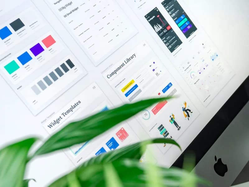
- Component Library: Buttons, forms, modals, navigation — built once, used everywhere
- Pattern Library: How components combine to create screens (onboarding flows, dashboards)
- Documentation: Usage guidelines, accessibility requirements, dos and don'ts
The Cost of Not Having One
For a 10-person product team without a design system:
- Designers spend 40% of their time recreating existing components
- Developers spend 30% of time reconciling design-code discrepancies
- QA catches UI inconsistencies that never should have shipped
- Brand trust erodes with visual inconsistency across touchpoints
Building Your Design System: The Practical Path
Phase 1: Audit (Week 1-2)
Screenshot every screen in your product. Group by component type. You'll immediately see the inconsistency — 8 button variants when you only need 3, 12 font sizes when you need 6.
Phase 2: Establish Tokens (Week 2-3)
Define your primitive tokens in Figma variables and CSS custom properties simultaneously:
:root {
  --color-primary: #3B82F6;
  --color-primary-dark: #1D4ED8;
  --space-4: 16px;
  --radius-md: 8px;
  --font-heading: 'Inter', sans-serif;
}
Phase 3: Build Core Components (Week 3-6)
Start with the components used on 80% of screens: Button, Input, Card, Modal, Navigation. Build them in Figma with Auto Layout and as React components with TypeScript props simultaneously.
Phase 4: Documentation (Ongoing)
Use Storybook for component documentation. Every component should have usage examples, prop tables, and accessibility notes.
Tools We Recommend for Indian Startups
- Figma — Industry standard, worth every rupee of the subscription
- Radix UI — Unstyled, accessible React primitives (apply your design system on top)
- shadcn/ui — Pre-built components that you own (not a dependency)
- Storybook — Component documentation and visual testing
- Chromatic — Visual regression testing (catches unexpected UI changes)
Invest 4-8 weeks building your design system properly. It will pay back 10x in developer velocity and product quality over the next year.